Optimization through Testing: A Peek Behind the Curtain
When clients ask us about exact page placement for their Roobrik call to action (CTA) or the perfect subject line for a re-engagement email offering the assessment, we provide guidance of course. But we also temper that guidance with the suggestion that they test, measure, and optimize to demonstrably see what works best for them.
To illustrate this process, let’s pull back the curtain a bit and share one of the tests we ran in 2020. The first step? Set a measurable goal. In this test we decided that we wanted to increase the start rate of our “Is it time to get help?” assessment by a measurable percentage. Could we do this with just some design and copy changes? We wanted to find out.
Applying user interface (UI) best practices, we designed 3 alternatives to our control. Then we put it out there and waited for sufficient volume to make a sound decision. The winning landing page actually improved starts by 15% — opening the door for us to optimize the rest of the tool.
Now the fun part. We asked Roobrik team members to predict which version of the landing page came out on top. The result? No one was right!
And that, perhaps, may be the most important takeaway. Our own subjective opinions simply cannot predict what will happen out in the wild. And that’s why it’s so vital that you test, not guess. So if you’re wondering whether you should reword your call to action (CTA), change the placement of the CTA on a page, or even try the assessment on new pages, our advice is test it and see. We’ll be happy to help give some advice to get you started based on what we know others have tried.
Can you pick the winner? Take a look below and choose which one you think came out on top. We’ll publish the results next month in Unstuck. (If you can’t wait to find out, drop Shelly@roobrik.com an email and she’ll let you know.)
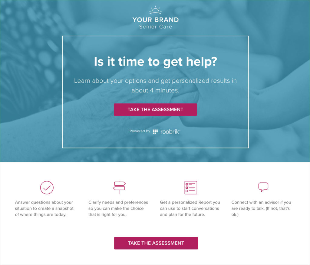
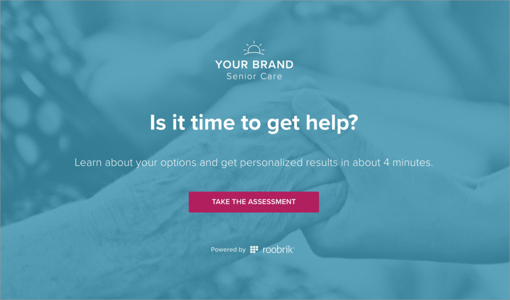
The Contenders
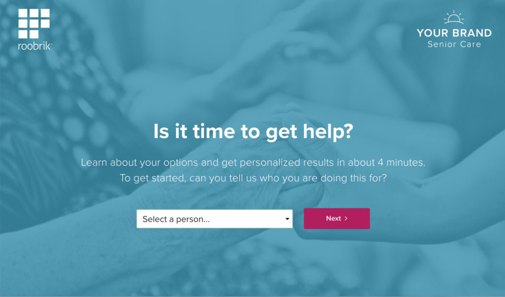
Our control, the original landing page with helpful tips on the left. Roobrik and the operator’s logos get equal weight and the Start button is white:
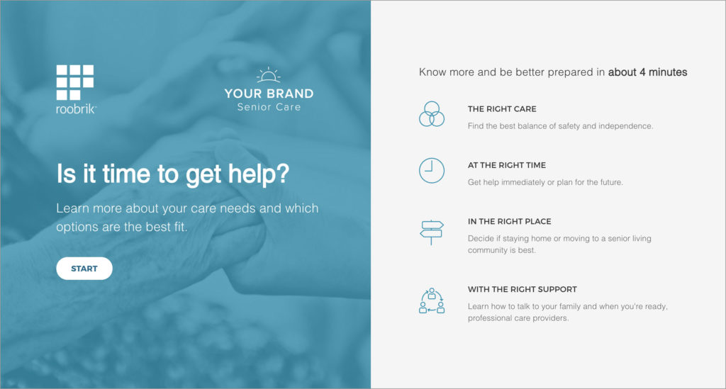
Helpful copy is below the CTA, the operator’s logo is predominant, and the brightly colored Start button appears in two places.
Minimal copy, the operator’s logo is predominant, and includes a contrasting color Start button.
Minimal copy, the brand’s logo and Roobrik’s are equal in weight, and includes a contrasting Start button. The first question of the assessment has been incorporated here.