Is your Roobrik CTA working as hard as it can?
Once a visitor comes to your website, the goals are to engage that visitor, provide some information and, perhaps most importantly, motivate the visitor to identify themselves and indicate their interest. Thus, the all important “call to action” or CTA.
On most web pages you’ll have multiple CTA’s and that’s appropriate. You want to give families the chance to reach out in the moment in a way that feels comfortable and easy. So how should you think about your Roobrik CTA? Here’s a primer.
Strategic CTA Placement Increases Engagement
You can put links to the Roobrik assessment on as many web pages/places as you’d like, but our data suggests that the following is optimal.
Corporate and community homepages: We recommend the Roobrik CTA in the lower two-thirds of the primary pages for three reasons:
-
Visitors to your homepage most often have an immediate need so the primary CTA should be to contact you.
-
Too many CTAs close together can overwhelm visitors. Giving choices as visitors scroll, however, can engage different audiences.
-
Our assessments are designed to capture a different audience than the typical “contact us” form. We help you reach anonymous browsers — people in data-gathering mode.
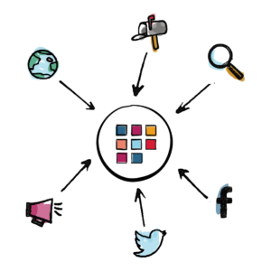
Beyond your homepage, we recommend including the Roobrik CTA on various internal pages to engage families as they browse your community locations, amenities, pricing and more. You can even place the CTA within pop-ups, for example, when a user indicates that they’re leaving your site.
Technical Flexibility to Match Your Goals
You can place the Roobrik CTA on your site in two ways — our widget or HTML.
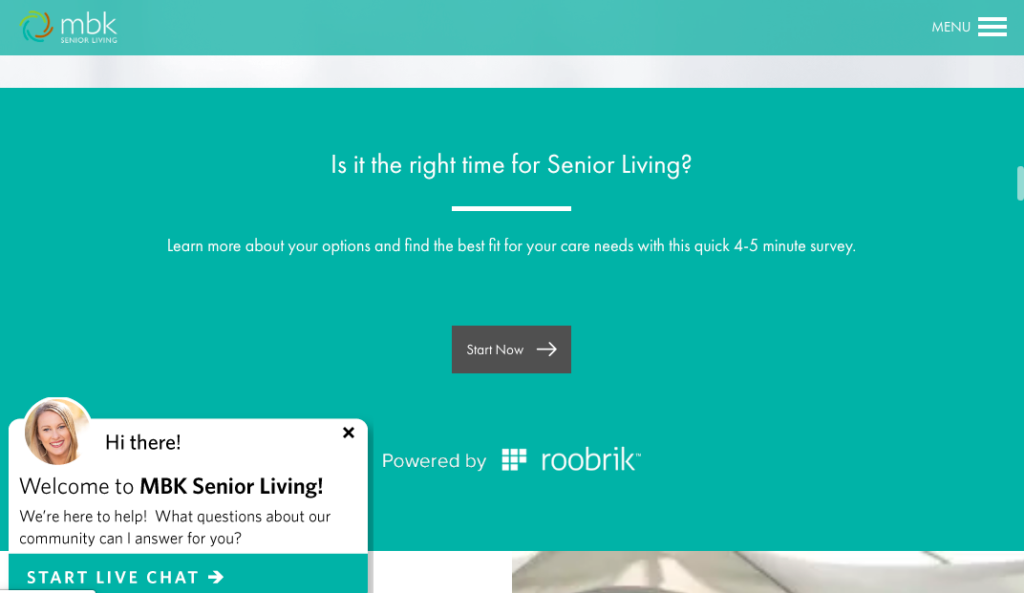
The Roobrik widget is a single line of JavaScript that is fully responsive (adjusts to the size of the user’s screen). You can customize the background with a color or image and insert your own copy in a font that matches your brand guidelines. Here’s an example from MBK Senior Living.
If you prefer, you or your agency can create your own CTA using HTML. In that case, we’ll provide you with the appropriate links to ensure correct tracking and attribution of each response.
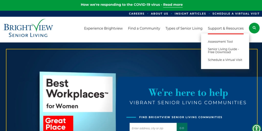
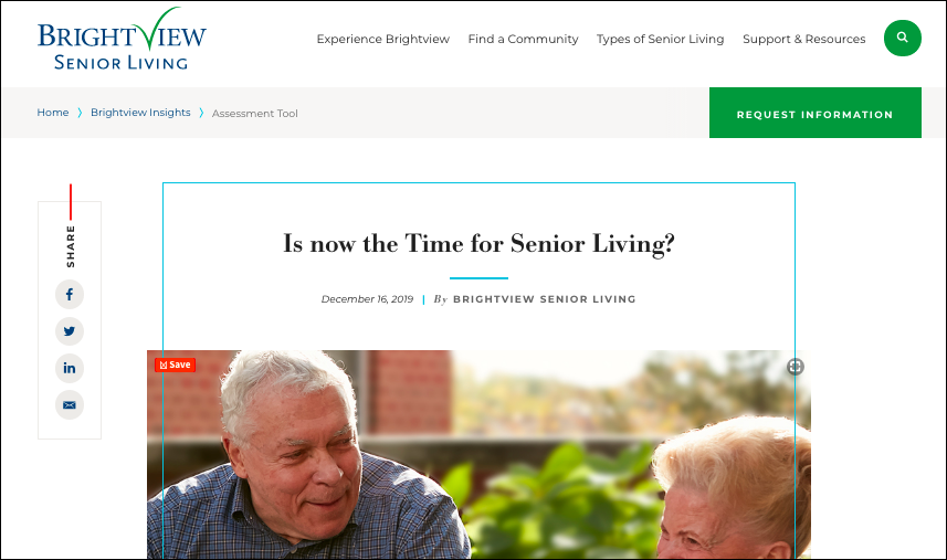
We encourage clients to be creative with their CTA language and placement, testing different approaches to see what works best. Brightview Senior Living places their Roobrik links throughout their website, even including it in their navigation as a resource. The link there leads to a page of information about making the right choice with the Roobrik CTA embedded.

Optimize Your Campaign with Page-specific Copy
When writing your CTA consider three things:
-
Capture attention:
There’s a lot to see on most senior living website pages. Visitors can easily be distracted as they search for information and answers. Set your CTA apart from regular page copy and “disrupt” their eye with color or font choices.
-
Instill trust:
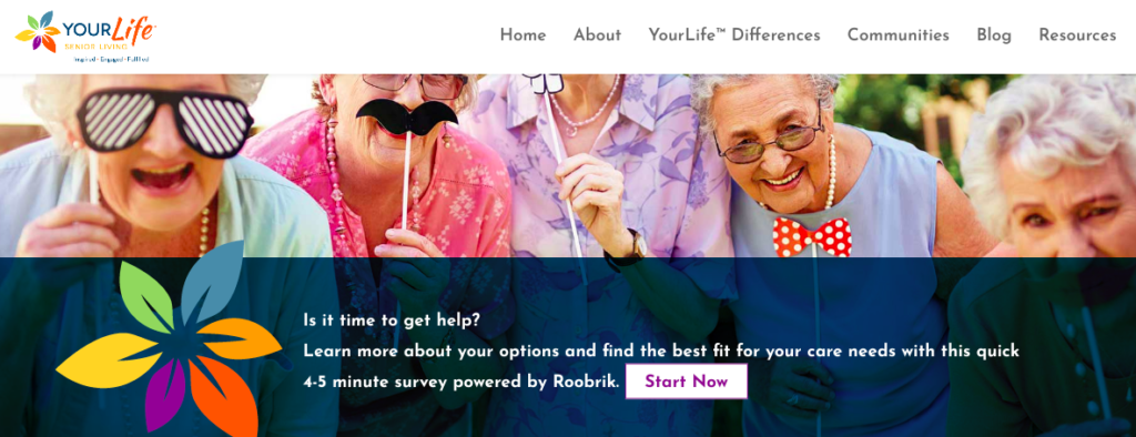
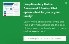
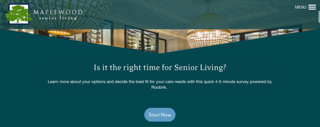
Because the assessment itself has a tone that’s purposely friendly and respectful, your CTA language should reflect that while being honest about the value. Roobrik offers two main assessments — ”Is it Time for Senior Living” focused on lifestyle as well as care and “Is it Time to Get Help” focused primarily on care issues — so CTA language generally reflects the linked assessment. Here are a few examples from our clients. In each case, we encourage clients to take this opportunity to ask the question that is on the visitor’s mind.
You’ll see that each captures attention through design, instills trust by using clear, friendly language and even stating how long the survey will take. Most of our clients choose to attribute the survey to us, understanding that having decision-science expertise from a third party is another way to build trust.


Be sure that the language you use reflects your brand as well. If your site leans to the lighter side, keep your Roobrik CTA cheerful and encouraging. If your site takes a more serious approach, keep that tone of assurance in your CTA copy. And remember, you can try different CTA’s on different pages to optimize your visitor’s experience.
-
Inspire action:
Note that in the examples above, the design and language build toward the actual CTA “button” — everything from “Start Now” to “Take the 5 Minute Survey.” The language you use should flow naturally from the accompanying text.
The Final (and Ongoing) Step: Measure and Test
As marketers know, the key to every tactic is performance and, ultimately ROI. At Roobrik, we encourage you to test various approaches to your CTA placement, design and copy, and we’re set up to help you see how each performs. We’re also happy to brainstorm with you to optimize your efforts.
The key to accurate measurement is including appropriate tracking links, also called tracking URLs or UTM parameters. Our team can provide you with links that, when clicked, can help you track what CTA they chose, whether they completed the assessment, and, of course, whether they opted to share their report and contact information with you.
We’re Here to Help
At Roobrik we’re as invested as you are in helping older adults and their families. That’s why, in addition to our monthly reports, our team is always available to discuss how you can optimize your use of the assessment tool — from testing CTAs to trying out new channels. Get in touch if you’d like to talk more!